
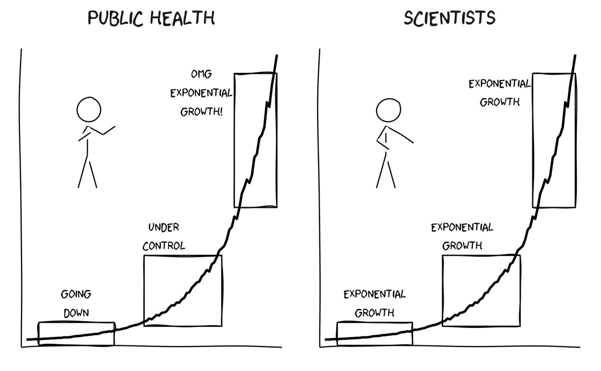
I have been thinking about how different people interpret data differently. And made this xkcd style graphic to illustrate this.
There seems to be a renewed interest in this tweet and I again get question if people can use the graphic. The answer is Yes, and to clarify this I have uploaded the code with an open licence so people can also modify it to their taste. github.com/mountainMath/x…

@vb_jens Jens, this is great (but I've only just found it via another's tweet) ... have you thought of signing your images, to distinguish them from xkcd's? Best wishes!


@vb_jens Left side: Dr Williams Right side: Anyone who paid attention in high school

@vb_jens I’ve been saying for like a year now the pandemic shows the failure of math literacy on a societal scale re. understanding what exponential growth means

@vb_jens @El86562179 Not Public Health... many of whom are data experts. Politicians, pundits, press - yes. But NOT Public Health please.

@vb_jens How do you differentiate between exponential and linear growth in the early stages?
