
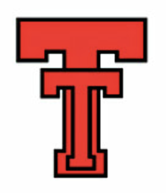
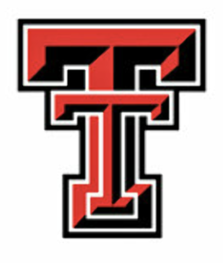
Some of y'all may see this as sacrilege but in my view, the non-beveled, old-school Texas Tech and Texas A&M logos are superior to the modern, beveled versions. Or perhaps this is just golden age thinking... who knows

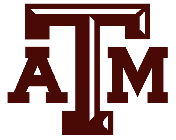

@JosephManero This is the most popular school of thought among Aggies
@JosephManero This is the greatest logo in Texas Tech history.


@JosephManero Nothing can be done to make either of these logos less nauseating


@JosephManero For once I agree with you. And I think the burnt orange of the 70s is much better than the burnt orange of today. The one today has too much red and not enough Brown like the 70s color

@JosephManero A & M looks much better without the bevel. I think Tech's looks better with though.

@JosephManero Imagine having letters in your logo