Elizabeth | E-com LP Designer & Developer @ElizzyBuilds
I design + build high-converting landing pages for e-commerce brands. Figma → Replo | UX + CRO . DM NOW → https://t.co/gvSAMEm8jL linktr.ee/ElizabethTech Ibadan, Nigeria Joined February 2025-
Tweets130
-
Followers362
-
Following3K
-
Likes5K
Not every landing page needs to shout to get attention. Sometimes, the right imagery, the right pacing, and a clear story are enough. Here's how I brought STORMROCK's experience together from top to bottom.
You have the idea. You know what you want to build. You can even explain it perfectly to your team. Then you open Figma... And suddenly, none of it makes sense on a screen. That's exactly why wireframes matter. They turn the conversation from: “Does this look good?” into: “Will this actually convert?” That's a much better conversation to have early.
I kept looking at this page and asking myself: “If I were the customer, what would I still want to know?” That question changed how I approached the redesign. I reworked the experience around the information that actually helps someone make a confident choice. Before and After Redesigned @figma #Webdesign #ecommerce #CRO
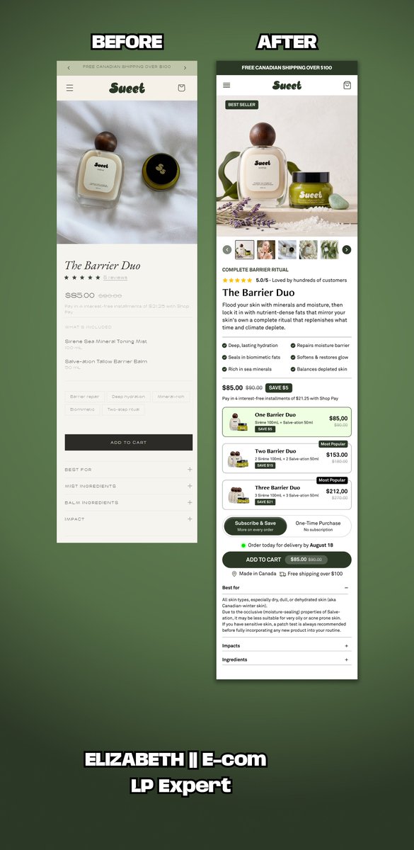
Looking back at this project, one thing stands out: A buy box isn't just where people purchase. It's where they decide whether they trust the product enough to buy. Every redesign reminds me that small UX decisions can have a big impact on the overall buying experience.
The "Buybox" is the most expensive real estate on your website. If it isn't converting, nothing else matters. Here is how I designed the Kennies buybox section @figma #Figma #Landingpage #Replo #UIUXDesign #Ecommerce

One thing I've learned while designing landing pages: A beautiful interface can't fix a weak page structure. Before I touch colors or typography, I focus on the customer journey. Every section needs a purpose. Every scroll should answer a question. Every CTA should feel like the natural next step. This is the planning stage behind a homepage I recently designed.
Yesterday I shared a buy box concept. Here's what inspired it. I kept looking at the original experience and felt the buying journey could be simpler. Not because it looked bad... But because there were opportunities to make the decision easier for the customer. Here's the before and after. The goal wasn't a prettier interface. It was a better buying experience. Which version feels easier to shop from?

Buy boxes are one of the most overlooked sections on a product page. They're not just where customers click "Add to Cart." They're where customers decide whether they trust your product enough to buy. I spent some time exploring a cleaner buy box concept focused on: • Better

Buy boxes are one of the most overlooked sections on a product page. They're not just where customers click "Add to Cart." They're where customers decide whether they trust your product enough to buy. I spent some time exploring a cleaner buy box concept focused on: • Better product storytelling • Clearer purchase options • Stronger buying confidence • A smoother mobile experience Curious... What's the first thing you look for in a buy box?
Before → After I challenged myself to redesign this hero section with one goal: Make the value proposition clearer and reduce friction above the fold. Here's what I changed: • Simplified the visual hierarchy • Brought key benefits closer to the CTA • Improved readability for mobile users • Created a cleaner path from first impression to action Every design decision should make it easier for someone to say "yes." Designed @figma .

Mobile isn't just a smaller version of desktop. it's where the customer journey begins for most DTC brands. This advertorial was designed with a clear reading hierarchy, intentional pacing, and strategic CTA placement to keep users engaged from the first section to the final offer. Here's the full mobile walkthrough.
This is the kind of ecommerce design I enjoy building most. Advertorial-style pages that: • grab attention fast • build trust naturally • educate while selling • keep users engaged longer Built in Replo for Goldielocks brand. #cro #ecommerce #replo
Following up on the desktop version I shared earlier. This is how the advertorial looks on mobile. I spent a lot of time making sure the spacing, hierarchy, and reading flow felt natural from top to bottom. Simple, clean, and built with conversions in mind.
June is here, and I'm already shipping. Just finished designing this advertorial page in Figma for a health product brand. The goal wasn't to make it "look nice." The goal was to: • Stop the scroll • Build trust • Increase conversions • Drive sales That's the difference
One thing I always keep in mind when building landing pages... If it only looks good on desktop, it's not finished. Most of your customers' purchases start on mobile. Which means every section, every headline, and every CTA has to feel effortless on a smaller screen. Mobile view for Bubble #Replo #Ecommerce #Shopify
One thing I enjoy about building advertorial pages is figuring out how to keep visitors engaged. Not for 5 seconds. Not for 10 seconds. But long enough to understand the value of the offer. Every section, headline, and image has a job: Turning curiosity into attention, attention
One expensive mistake I keep seeing: Brands spend thousands driving traffic with great ads... ➡️ Then send people to a product page that expects complete strangers to trust them in 5 seconds. If a visitor lands on your page and their first thought is, "Why should I believe this?" ...the page has already lost. Good advertorials don't just sell a product. They educate, build trust, answer objections, and create belief before asking for the sale. That's why I built this one @replohq Because sometimes the highest-converting page isn't your product page... It's the page that convinces people your product is worth buying in the first place.
Your product page shouldn't have to do all the heavy lifting. Cold traffic needs context. It needs proof. It needs a reason to trust you before they're ready to buy. That's why listicle pages work so well. They warm people up before they ever reach your product page, making the buying decision feel much easier. Designed @figma
Premium static Ads for Bubble brand. ⚡ Crafted to stop the scroll and earn the click.

One thing I enjoy about building advertorial pages is figuring out how to keep visitors engaged. Not for 5 seconds. Not for 10 seconds. But long enough to understand the value of the offer. Every section, headline, and image has a job: Turning curiosity into attention, attention into trust, and trust into conversions. Built @Replo.
A client once asked me: "What's the point of a listicle page?" POV: Imagine meeting someone for the first time and asking them to trust you immediately. That's what many brands do when they send cold traffic straight to a product page. Listicle pages take a different approach. They educate first. Build trust second. Recommend the product third. That's the principle behind this @replohq build.
What's an advertorial, and why should brand owners care? Most people don't buy the first time they see your product. They have questions. They have doubts. They need a reason to trust you. That's where an advertorial comes in. It educates, builds credibility, handles objections, and naturally leads visitors toward a purchase. That's exactly what I focused on while building this advertorial page @replohq
From Figma to Replo. Every section is optimized for desktop, tablet, and mobile, keeping the reading experience smooth and conversion-focused.
June is here, and I'm already shipping. Just finished designing this advertorial page in Figma for a health product brand. The goal wasn't to make it "look nice." The goal was to: • Stop the scroll • Build trust • Increase conversions • Drive sales That's the difference
This is the kind of ecommerce design I enjoy building most. Advertorial-style pages that: • grab attention fast • build trust naturally • educate while selling • keep users engaged longer Built in Replo for Goldielocks brand. #cro #ecommerce #replo

Taofeek muminat @TMuminat50582
20 Followers 19 Following High-Converting Static Ads & Graphic Designs. I Create Scroll-Stopping Visuals, Fix Weak Creatives, and Help e-commerce Brand Stand Out Online.
【絹乃峰®】Akan... @AkanaBrewing
103K Followers 10K Following 2014年設立公設民営純米蔵「絹乃峰®」「MININOMINE™」 駐車場10台分完備 国旗掲揚 島根県 飯南町 赤名 取扱商品:日本酒 清酒 そば 林檎果汁 フグみりん干し 高級酒器等 このアカウントは20歳以上を対象にしています
Ms Complex Creatives�... @creatives_ms
26K Followers 27K Following 🦄 The one and only girl from complex creatives. “✉️ DM me for LOGOS, Banners (youtube,twitch ,facebook,twitter, offline,starting soon,will be rightback)”
Debby | Shopify Landi... @deborah_builds
5 Followers 51 Following I help Shopify brands turn traffic into sales with high-converting landing pages & PDPs. Designed in Figma, built in Replo. DM for your projects
Zach Wright @zachwrightsyft
398 Followers 814 Following Co-founder @syftaix. Father of 2 boys. Interests in AI, Personal Health, Houston Sports, and learning French.

Bülent DMK @im_bulent
4K Followers 5K Following 🗓️Jour 368 📰 https://t.co/pEKcXIx4vt 🤫 https://t.co/xd3cKVUs5Y 940€ 💻 https://t.co/vIE4oDnVvi 400€ 🦾 https://t.co/9urtGS52Lx 200€ 📸 https://t.co/GcWmfaULH0 50€ 🏎️ https://t.co/QlvSsVuBZ3 6% 🏠 https://t.co/3X3bB5qB5d
Shariful Islam @sharifuldigital
5K Followers 4K Following Brand Strategist । Digital Marketer । Mentor @ DigitalMastery । #2 in BD for Branding & Positioning (Favikon 2025) | Sr. Brand & Comm. Executive at @cementcrown
Michael |DTC| Convers... @LPagebuilder
228 Followers 1K Following Helping DTC brand to improve conversion rate with landing page focus on clarity. Kajabi Design || Figma LandingPage Design | Replo Design |
Keppio | Influencer M... @keppio_official
122 Followers 445 Following Find influencers, run campaigns and track results in one platform 🔍 Built for brands that want real performance 🚀
Zargam Ali | Ad Creat... @imzargam
878 Followers 2K Following Crafting high-converting FB/TikTok ads for brands, ecom stores & dropshippers | Video & Static Ads 🚀
Minesh Mistry @MineshMist30950
80 Followers 798 Following Shopify Growth | Affiliate Marketer | Self-Employed | Freelancer | Shopify Experts
Jason @jason_zig
356 Followers 2K Following 20/20 product vision 🚀https://t.co/ZWZOiTl22g - ~140K MRR
naoretion - نؤور @naoretion
514 Followers 5K Following
francktextile.co @franck_textile
525 Followers 6K Following Production & personnalisation textile + marketing underground
The Landing Page Guy @dlandingpageguy
37 Followers 139 Following I design & build landing pages that help eCommerce brands sell more. Figma • Replo • Shopify • Instant • GemPages
Oprah Winfrey @EthanCartecz7
3 Followers 109 Following
Sheikh Shihab @Shih29261Sheikh
1K Followers 4K Following AI Product Designer |Frontend Developer| Logo Branding| Web & Mobile Design WhatsApp https://t.co/3wZdwwiZKE
sophia Alex @Alexhallerbnh9
7 Followers 234 Following want to loose weights and get fit check this link check this https://t.co/cbPoMD8bxT
Wenenda Godswill @WenendaGodswil8
34 Followers 521 Following Football player ⚽|| MUFC ❤️ || Real Madrid 🤍 || CR7 🐐 || Davido
Zigpoll @zigpoll
1K Followers 3K Following 🚀 On-site, email, and SMS surveys. Post purchase surveys. Powerful @Shopify App. @Klaviyo Integration. 100M+ surveys completed & analyzed. Use for CRO & more.
ODLandingPages @ODLandingPages
58 Followers 304 Following Building high-converting landing pages for eCommerce brands. Figma • Shopify • Replo • Instant • GemPages.
DTC Landing Page Desi... @Landertechy
168 Followers 3K Following I design high-converting landing pages that turn clicks into customers. Most stores don’t have a traffic problem, their pages just don’t convert.
Fernando Santos @Fernandios_2003
50 Followers 132 Following Crafting stories frame by frame. Video Editor focused on pacing, visual narrative, and post-production.
porsiaca @porsiaca9q71
45 Followers 2K Following socorro me auxilian! marina mora #estaséntodas fisioterapeuta doctor Segovial Physical therapy #therapys te ayuda con tu terapía doc Apocalípsis 16;15
Dr. Ivan Avalos | Gin... @DoctorAvalos
4K Followers 209 Following Medicina basada en evidencia para el cuidado materno-fetal.
Faith John @Adeife7667
91 Followers 320 Following Conversion-focused landing page builder || Figma-Replo Expert Helping brands scale with high-performing pages 📩 Dm for more https://t.co/4PWukR0lla
Favour Abiodun E-COM ... @phavouritee
83 Followers 716 Following Helping ecom brands scale with high-converting pages Landing Page Design & Development Replo | Instant | Figma | AI Tools | Static Ads
J.O @julianoribe
67 Followers 371 Following
Nancy | OMGO Dropship... @Nancy_jav
20 Followers 75 Following Sharing insights from China’s ecommerce supply chain. Product sourcing | Fulfillment | Behind the scenes Helping ecommerce brands grow with reliable operation
Etta | Substack & Bee... @EttaStackSetup
13 Followers 31 Following Beehiiv & Substack Technical Specialist ⚡️ Custom domain/DNS, landing page design, theme styling & welcome flows. Helping creators scale.
Muhammad Ali @im_ali_20
6 Followers 85 Following
Cyrille @Cyrillecic
140 Followers 4K Following Recevez ici les meilleurs formation qu'il vous faut pour bâtir un meilleur empire en e-commerce, trading,SMMA, crypto etc... 100% de confiance
Douglas G @DoglaoDigital
121 Followers 997 Following Creative Strategist & DTC Growth Operator | $80K+ generated for eCommerce brands through direct-response ads and conversion-focused creative
Kristi @kristisoomer
2K Followers 2K Following Founder @encircled | #ecommerce maven #podcast | former @pwc_canada @thoughtworks @colgate
BenEcom @BenSalemane
147 Followers 2K Following Ne perdez pas de temps. Créez un sentiment d'urgence. Fixez des délais. Allez vite, échouez vite pour réussissez rapidement🦅
Etienne "Big E." Taga... @etienne_tagada
25 Followers 66 Following Building Tagada, the fastest way to launch high-converting ecommerce funnels. Watch me build it in public 👇
smat @intgame0
490 Followers 7K Following

Kabeer Raza @KabeerRazag5
22 Followers 129 Following Product Designer & Framer creator. Building premium templates for web3 and fintech brands.
Elizabeth || Landing ... @elizabethe47327
125 Followers 2K Following I help ecommerce brands turn visitors into buyers through high-converting landing pages & product pages. Focused on clarity, trust & conversion psychology.
Abdul Rafay | Ad Crea... @Abdulra15715499
37 Followers 234 Following Scaling DTC ecom brands with meta creatives
Mithaz @Mithazzzzzz
3 Followers 22 Following
Annie C GENX UGC crea... @AnnieMonetize
36 Followers 241 Following GENX UGC creator. Travel, dog, lifestyle and more. I’m a middle aged woman who knows how to talk about the GENX challenges and desires. Link to portfolio.
Candace | GEN X UGC C... @contentxcandace
16 Followers 91 Following Fashion, beauty & wellness for women 40+ Engaged midlife audience UGC Creator | Collabs open
Siyam @SiyamMd72575
18 Followers 52 Following
株式会社コピー... @copy_writter
173K Followers 5K Following ㍿コピーライターの社員で運営中。100円で入社できるのでご検討ください。 https://t.co/d8Zy6dacL4 (代表:はせがわてつじ@aseetsu)
Dua Javed @duajaved_
6 Followers 38 Following Conversion Copywriter for Wellness Coaches 🌸 | I turn cold traffic into brand growth and devoted clients | Copywriter | Co-Founder @LinkeCo
Elizabeth Landing Pag... @Divance_Ecom
15 Followers 22 Following
Greenie @greenieglow
50 Followers 2K Following
Taofeek muminat @TMuminat50582
20 Followers 19 Following High-Converting Static Ads & Graphic Designs. I Create Scroll-Stopping Visuals, Fix Weak Creatives, and Help e-commerce Brand Stand Out Online.
Ms Complex Creatives�... @creatives_ms
26K Followers 27K Following 🦄 The one and only girl from complex creatives. “✉️ DM me for LOGOS, Banners (youtube,twitch ,facebook,twitter, offline,starting soon,will be rightback)”
Metro Brewing @MetroBrewing
13K Followers 908 Following


North Brewing Co @NorthBrewCo
15K Followers 2K Following 🍻 Webshop – https://t.co/DQG6lrG3lr 📧 Trade – [email protected] ❤️
Cambridge Brewing Co @CamBrewingCo
15K Followers 7K Following The coolest little brewpub in the world, located in Cambridge, MA, USA since 1989. Cool beers, crazy people. Or vice versa.
Independence Brewing @indybrewing
14K Followers 2K Following Independent Thinkers and Drinkers. Proudly brewing craft beer for the independent since 2004 in Austin, TX. 21+ to follow.
Drake's Brewing Co. @DrakesBeer
21K Followers 263 Following Drink Different, Drink Drake's... Your local East Bay Brewery, since 1989. #DrinkDrakes
Tallgrass Brewing Co @TallgrassBeer
13K Followers 4K Following Kansas' largest craft brewery with regional distribution in 18 states from a 60k sq ft brewery. No longer in production.
Begyle Brewing @BegyleBrewing
12K Followers 943 Following A Community Supported Brewery – Chicago, IL
Real Ale Brewing Co. @RealAleBrewing
18K Followers 395 Following Working in the Texas Hill Country from a foundation of time-honored brewing tradition, we believe minimal processing produces maximum flavor. #onlyinTX
Deep Ellum Brewing @deepellumbrewco
17K Followers 839 Following Rough Edges. Deep Roots🍻 | Born in Deep Ellum, TX Must be 21+ To Follow and Engage with Content
Steel Toe Brewing @SteelToeBrewing
13K Followers 407 Following We are a small MN craft brewery with big dreams of staying small.
Pizza Port Brewing Co... @PizzaPortBeer
19K Followers 152 Following The home of tasty grub and grog, where good food and good beer bring good cheer! https://t.co/qQ8UXnTlcG

Propeller Brewing Co @PropellerBeer
14K Followers 10K Following Halifax's North End craft beer 🚐HRM Home Delivery daily. 🍺Prop Shops open daily. 2015 Gottingen • 6128 Quinpool • 617 Windmill • 1225 Bedford Hwy
Sly Fox Brewing Co @SlyFoxBeer
15K Followers 663 Following Independently brewing world-class beer in PA since 1995. Your favorite brewery’s favorite brewery.
Other Half Brewing @OtherHalfNYC
20K Followers 179 Following Craft brewery in Brooklyn, NY. Pushing the boundaries of beer since 2014. Order your favorites for shipping or pickup at one of our 8 taprooms.
Mike Hess Brewing @MikeHessBrewing
14K Followers 2K Following Veteran-founded SD brewery, now a craft powerhouse w/ 7 CA spots & SoCal distro. Award-winning beers. Uniting for causes—raised $100k+ for charity! LA in 2026.
Hops & Grain Brewing @hopsandgrain
14K Followers 3K Following Crafting beer in ATX since 2011. 21+ to follow
El Segundo Brewing @ESBCBrews
13K Followers 1K Following Open for indoor/outdoor drinking! Mon-Wed 4-9 // Thursday 4-10 // Friday 3-10 // Saturday 12-10 // Sunday 12-9 ***Must Be 21+ To Follow***
Two Roads Brewing @2RoadsBrewing
14K Followers 1K Following Here's to taking the road less traveled, in life and in beer! 21+ only.
Redemption Brewing Co... @RedemptionBrew
19K Followers 1K Following Cracking beers brewed in North London since 2010. 📍Our matchday Taproom is open for all home games, inc. during the week (4pm). Visit our pub @AntwerpArmsAsoc
Pressure Drop Brewing @PressureDropBrw
19K Followers 906 Following Making beer in London since 2013. Taproom open Fridays 5-9pm + Saturdays & Sundays 12-8pm
Lake of Bays Brewing @lb_brewing
11K Followers 3K Following Taste the Great Outdoors. Handcrafted in small batches in Baysville, Ontario since 2010.
(512) Brewing @512brewing
21K Followers 2K Following Microbrewery in the heart of Austin making iconic beers with American malts since 2008. Pecan Tree Patio open Sat 1-5

Lonerider Brewing �... @loneriderbeer
13K Followers 2K Following Ales for Outlaws. Effect change, don’t be an audience. Walk your own path, and instead of thinking outside the box imagine what if there was no box. #NCBeer
West Sixth Brewing @WestSixth
12K Followers 584 Following Kentucky proud independent brewery dedicated to doing good & brewing great beers. Production facility & taproom in historic Rainbo bread factory in Lexington KY
Southern Tier Brewing... @stbcbeer_buf
15K Followers 255 Following Bringing Southern Tier beer to the good people of Buffalo. 🍻
Natty Greene’s Brew... @Natty_Greenes
11K Followers 2K Following Greensboro-born & brewed 🍺 Smash burgers, live tunes, cold beer. See you in the Beer Garden. #DrinkLocal
Lakewood Brewing Co. @LakewoodBrewing
13K Followers 619 Following We've been brewing up Seriously Fun Beer on the east side of town since 2012. Come visit our Taproom, Kitchen, & Beer Garden open 7 days a week.
Triton Brewing Compan... @TritonBrewing
19K Followers 21K Following Hours: Wed-Thurs, 3-10pm; Fri-Sat, 12-10pm; Sunday 12-9pm. #TritonBistro #TritonStrong #BrewedOnBase #FtBenIN
Westbrook Brewing Co @WestbrookBeer
12K Followers 148 Following Craft brewery in Mt. Pleasant, SC. Taproom open Tues-Fri 4-8pm and Sat-Sun 12-6pm
Coronado Brewing Co. @CoronadoBrewing
19K Followers 1K Following Est 1996 | World Beer Cup Champion Mid Size Brewing Co. & Brewmaster 2014 | Brewing is our middle name. Age 21+ Only
Revolver Brewing @RevolverBrewing
12K Followers 86 Following
Flying Fish Brewing C... @flyingfishbrew
14K Followers 1K Following Discover the Flavor, Join the Adventure! 🍻
Rad Brewing Co @RadBrewCo
12K Followers 2K Following
Tired Hands Brewing C... @tiredhandsbeer
12K Followers 68 Following Ephemeral Saisons. Milkshake IPAs. Strange and Beautiful.
Golden Road Brewing @goldenroadbrew
17K Followers 3K Following Drink responsibly! 21+ only share with people of legal drinking age. Community Guidelines and more! ⬇️
Hangar 24 Craft Brewi... @Hangar24Brewing
13K Followers 584 Following Connecting the world through shared adventures over a beer. #Hangar24 🍻 Adventures We Share.
Aviator Brewing Co. @AviatorBrew
12K Followers 3K Following Aviator Brewing Co. (919) 567-2337 [email protected]
Moor Beer Co. @drinkmoorbeer
20K Followers 1K Following Natural Live Beer since 2007. Taproom & Brewery 10 min walk from Bristol Temple Meads. The Vaults at Bermondsey Beer Mile, London
Dorset Food & Drink @DorsetFoodDrink
19K Followers 2K Following We're all about Dorset food and drink! Enjoy the Tastes - Support the Producers - Celebrate the Culture - Love the County.
AG1 @drink_AG1
19K Followers 311 Following Whole body health starts here. AG1 is Foundational Nutrition: the daily nutrients you need for brain, gut & immune health. #DrinkAG1
CL ATL Food & Drink @cl_atlantafood
107K Followers 724 Following News on Atlanta restaurants, food and life from Creative Loafing.
Peak Organic Brewing @PeakBrewing
11K Followers 3K Following Crafting delicious beer using artisan, local and organic ingredients. (https://t.co/POgTT0gLqm)
Pisgah Brewing Co. @PisgahBrewing
17K Followers 220 Following ...Treat Yourself... #avlbeer #ncbeer #avlmusic #avlent #avl
monkish brewing co. @monkishbrewing
15K Followers 79 Following small brewery & tasting room // Belgian-ish & IPA-ish beers // Torrance, Los AngelesYou might like