
Dear Canada: that is a really misleading graph. Here is the share of employment by sector since 1976.
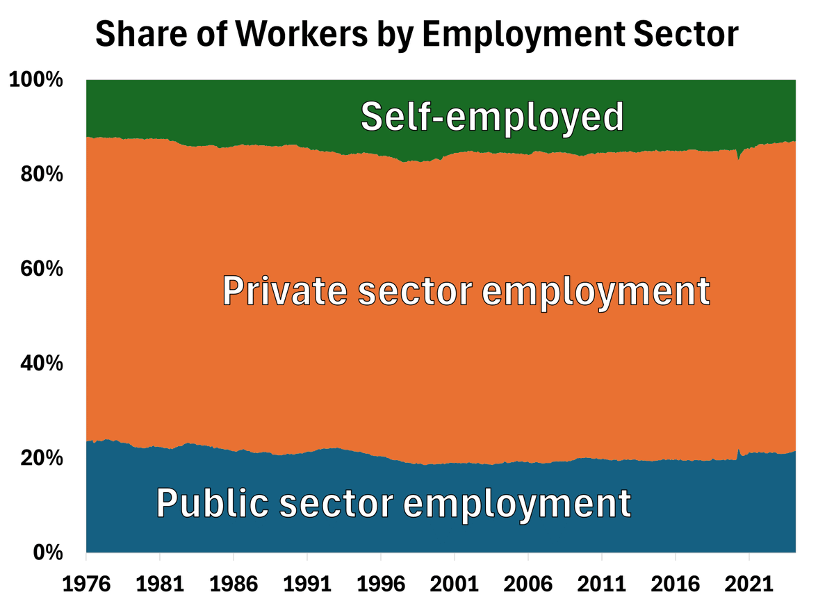

Dear Canada: that is a really misleading graph. Here is the share of employment by sector since 1976. https://t.co/xZDQ6Isd73
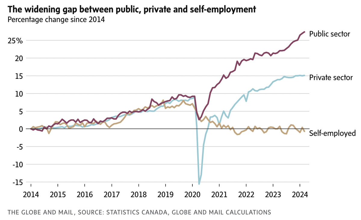

@DTCochrane It’s a good addendum to the chart but not sure this is better. Data doesn’t appear to include the last couple years which are the most important point of the other chart and it’s very hard to read trends the way it’s presented.

@DTCochrane Why does it end in 21 Because by 2024 it's 25% in public sector

@DTCochrane Thanks. Context like this is important. Do we have data for 2021-3 ? (Or beyond) ?

@DTCochrane It’s fair to look at indexed growth provided you also consider broader context. The slow down in new business creation is a major long term growth challenge though.

@DTCochrane So you're saying the public sector is as high now as it was back in the late 1980s/early 1990s where Canada was in such dire economic straits that Chretien had to take an axe to the public sector in order to save us? I'd say both those graphs say the same thing.