Ayoub Bennouna @AyoubDesignLab
Brand & Logo Designer | I designed for Harvard & MIT ayoubbennouna.com Joined September 2024-
Tweets37
-
Followers12
-
Following18
-
Likes118
@VadimCarazan People out there copying our work and we don’t even know it « yet » 😳 Really clean logo tho!
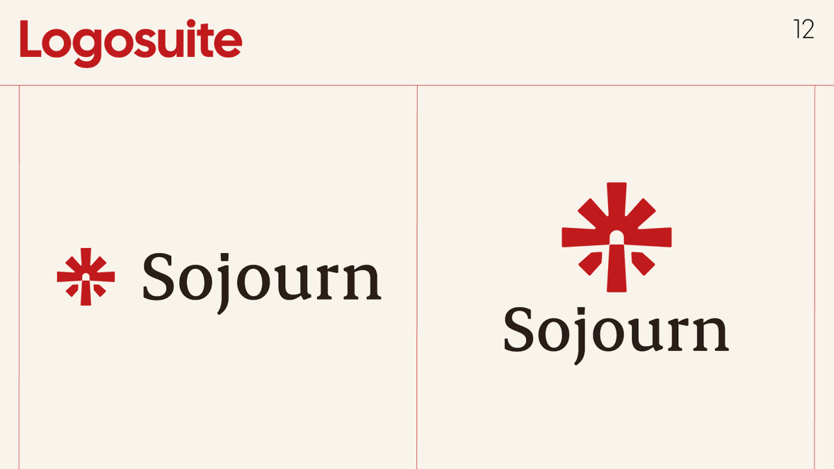
Worked on a brand last year while the company was still in stealth. Before launch, they pivoted to a completely different identity direction. Kinda fascinating seeing two very different interpretations for the same company.


Worked on a brand last year while the company was still in stealth. Before launch, they pivoted to a completely different identity direction. Kinda fascinating seeing two very different interpretations for the same company. What do you think?


@Abstudiobrand Logomark screams speed and movement by the sharp cuts and inclined shapes, well done!
@DlaniD Definitely prefer the top logomark, typo wise, both of them are good in their own way. Would go for top logomark with bottom typo personally. Awesome work!
A look at some slides of the branding presentation I did for a client recently.


@ephraimdzn @charles_awom_ @EphraimAkanmu Looks awesome, I wonder how versatile and scalable it is 🤔
@khrcreatives The rounded details on the typo make all the difference, very clean
Personal branding explorations: Ayoub Design Lab. All built based on one single shape.


Brand collateral design explorations for MDM, some using the Conway's Game of Life shapes.


@DBWORKPLAY1 Good move you applied the pixelated effect on the logomark only, it’s balanced with that sans-serif font. Looks awesome!
@Daviowhite x.com/AyoubDesignLab… ayoubbennouna.com
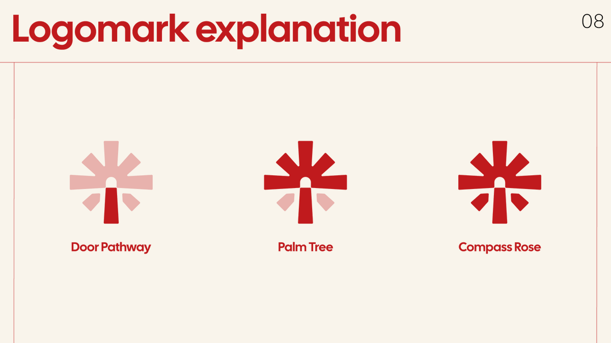
I designed the MDM logo using only "+" signs to live inside Conway’s Game of Life. What it generates became the visual language of the brand.


@farazcreatives Bottom left is great, but would be worried it reads as: KP. Good choice of the italic style, conveys speed and precision which works with the star, love it!
@DesignGuru01 The definition of efficient minimalism, well done! Also love the gradients alongside the grainy effects.
I designed the MDM logo using only "+" signs to live inside Conway’s Game of Life. What it generates became the visual language of the brand.
@monogramdude Very clean, sharp corners, clean cuts, can't wait to see the full branding using this logomark.
Spatial, environmental, and editorial branding explorations for TechNatSec.


@creativemints @framer Love this kind of « explicit design », showing the signal on the logo is such a good idea. Impressive work!
Full case study here👇 ayoubbennouna.com/projects/techn…
Two years later, I revisited the branding I originally designed for the HBS & MIT Sloan Technology & National Security Conference.


Marketore @marketorecom
541 Followers 4K Following Embrace Your Creativity. Marketore is a marketplace that provide diverse design resources and digital assets.
Technology & National... @TechNatSec
69 Followers 53 Following MIT x HBS | April 3-4, 2026 | Tickets @ https://t.co/gCOKRMrZt5
MD SOBUZ HOSSEN @sobuzbd372
768 Followers 3K Following Hello, I am Sobuz. I am Instagram Organic Growth Expert. and Digital Marketer.
Faraz | Logo & Brand ... @farazcreatives
21K Followers 527 Following Brand designer for SaaS, AI & Web3 founders. I create premium logo design & brand identity for high-growth startups. For inquiries → [email protected]
elhoussaine chahboun @elhoussainechah
8 Followers 216 Following Pure Maths, Computer Graphics and Motion Design

safwane hennani @HennaniSafwane
98 Followers 535 Following Pharmacy student 💊 21/2 ♓ Gamer Discord : dark soul2615 /Geng eSports fan ♥️
howa hadak @bbbl30713
0 Followers 75 Following
Sam Hox — Second Ei... @secondeight_
3K Followers 390 Following SECOND EIGHT® CRAFTING MEMORABLE EXPERIENCES. https://t.co/fceTQAMKho
Amine Bennouna @AmineBennouna8
267 Followers 260 Following Assistant prof at Kellogg, Northwestern | MIT PhD | Research in AI and Optimization.
Krill Brill @Brillkrillprill
1 Followers 88 Following

Ab studio | Brand Des... @Abstudiobrand
7K Followers 213 Following Logo Designer | Modern & Timeless Creations Building @brandmarkss | DM For Collaborations
Faraz | Logo & Brand ... @farazcreatives
21K Followers 527 Following Brand designer for SaaS, AI & Web3 founders. I create premium logo design & brand identity for high-growth startups. For inquiries → [email protected]
Mike I Creative Mints @creativemints
17K Followers 208 Following Graphic designer with 20 years of experience / Available for work https://t.co/P1NpJkny6Y https://t.co/cPgwZ3HTPm
Alex Cristache @AlexCristache
20K Followers 586 Following Design Strategy & Leadership Support for Marketing Teams ⬩ Founder at @MindfulMotif ⬩ 25+ Years in Digital ⬩ Explorer of art & color through #MindfulPalettes
Technology & National... @TechNatSec
69 Followers 53 Following MIT x HBS | April 3-4, 2026 | Tickets @ https://t.co/gCOKRMrZt5
Kyle Anthony Miller @kyleanthony
34K Followers 1K Following An American brand designer, designing for the new industrial age.
Vadim Carazan @VadimCarazan
12K Followers 895 Following I've spent 10+ years building brands that people remember. https://t.co/cUKuCzVZ3m Design subscription for B2B AI https://t.co/kPhzqza9aZ Design sprints for AI founders

Caedrel @Caedrel
506K Followers 1K Following streamer | league degen | variety games finisher | ex pro player | ex caster @LosRatonesLol @DPMLol @RedBullgaming [email protected]
Keileth @keilethh
14K Followers 326 Following founder & brand designer https://t.co/wDiIDrC4Gh clients include: @shadcncraft @/swans.co @hypha_sh @bitrecs
Sam Hox — Second Ei... @secondeight_
3K Followers 390 Following SECOND EIGHT® CRAFTING MEMORABLE EXPERIENCES. https://t.co/fceTQAMKho
Dmitri @dmiiiitrii
29K Followers 40 Following Independent Icon Designer ❋ Illustrator ❋ Brand Identity ❋ UI/UX Design ❋ Clients include → @meta @google @paypal @netflix @binance & more.
Houssam Beniken @houssam_b01
9 Followers 15 Following 🎥 Videographer | 🩺 Med Student | 🚀 Building my content agency and sharing my journey. 📩 [email protected]
Adobe @Adobe
957K Followers 212 Following Empowering everyone to create. ✨ Need help? Reach out to @AdobeCare
Procreate @Procreate
313K Followers 720 Following Unleash your creative potential with our powerful illustration and animation apps, Procreate and Procreate Dreams.
Adobe Photoshop @Photoshop
3.0M Followers 799 Following The industry standard in digital imaging and used by professionals worldwide for design, photography, video editing & more. | For Customer Support: @AdobeCare.You might like